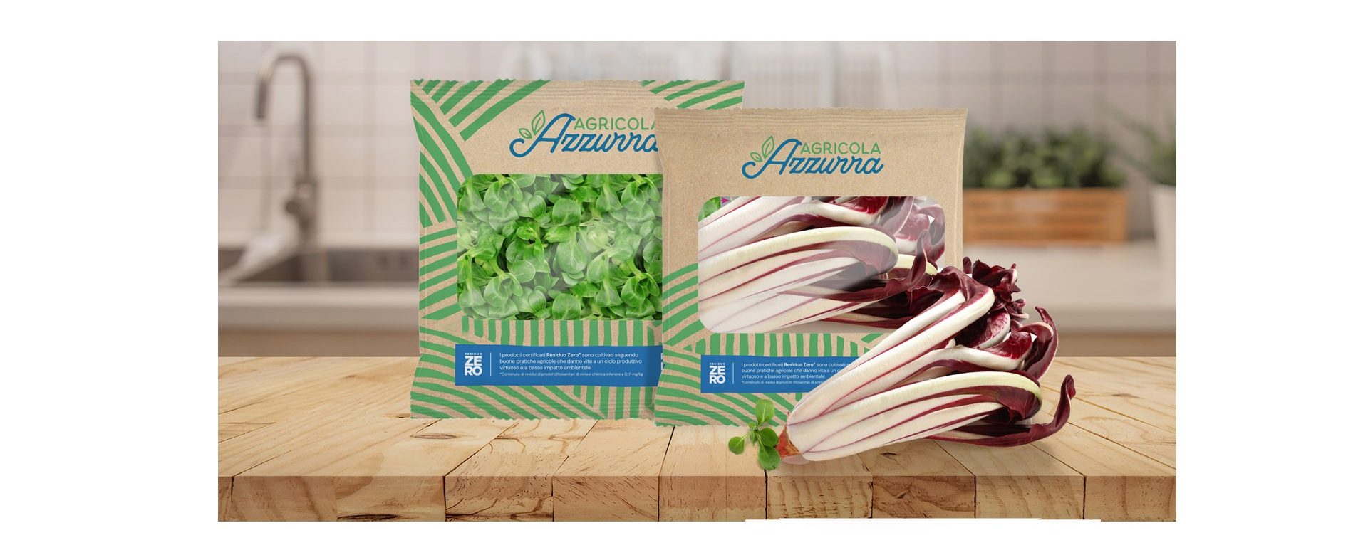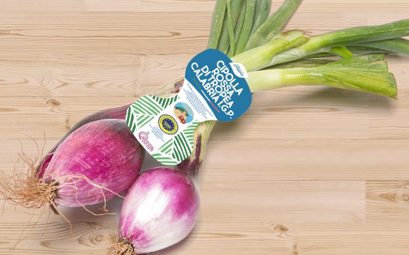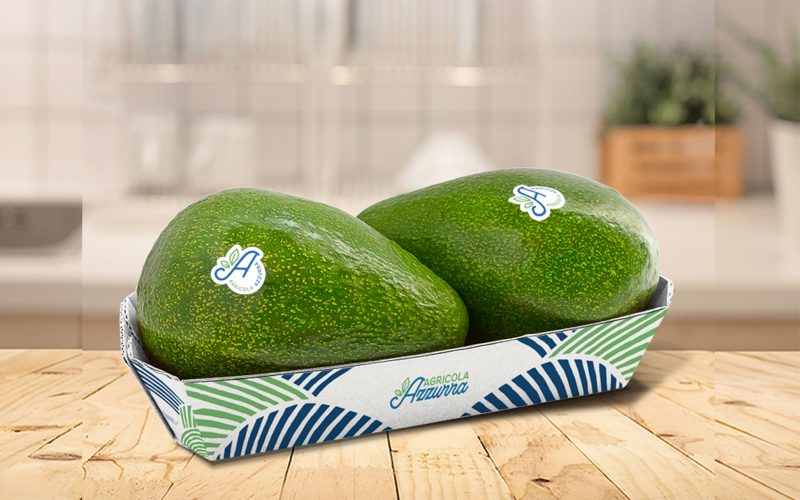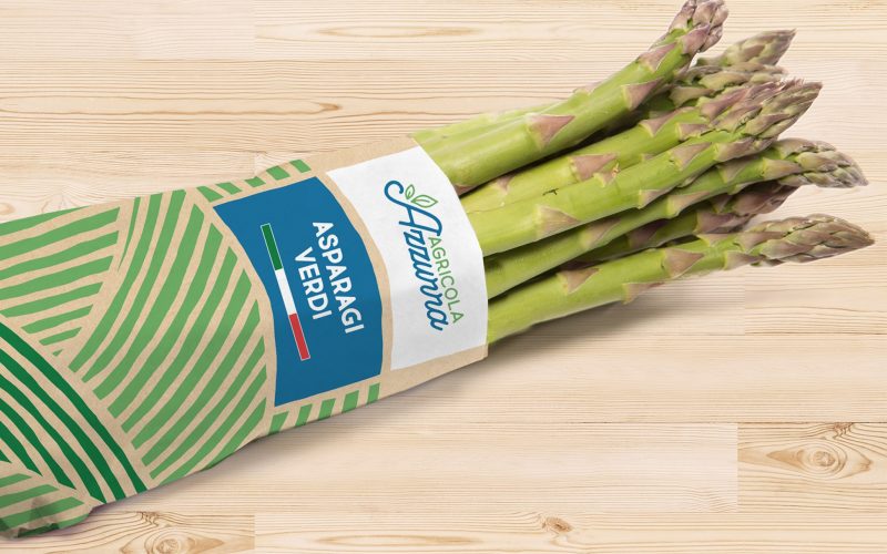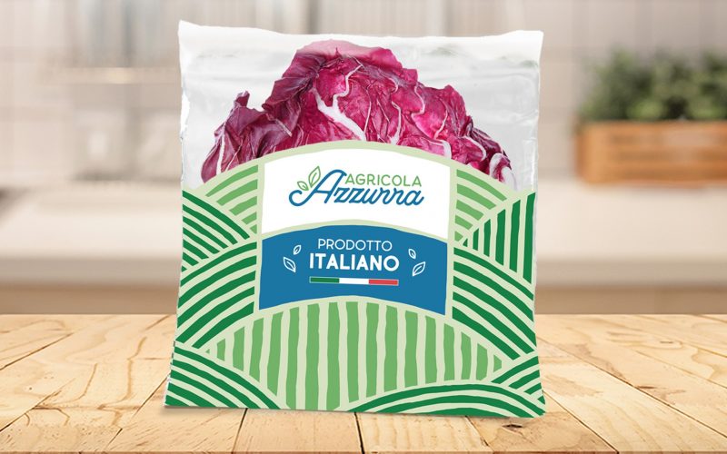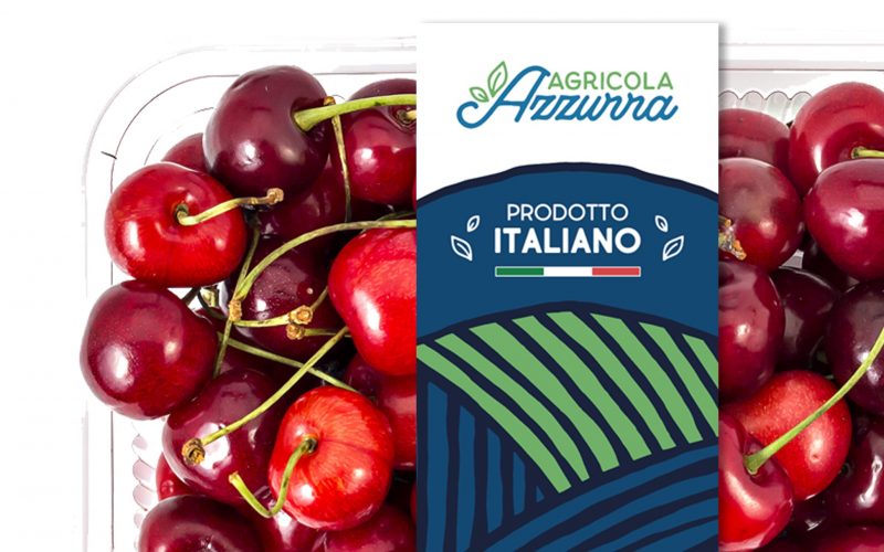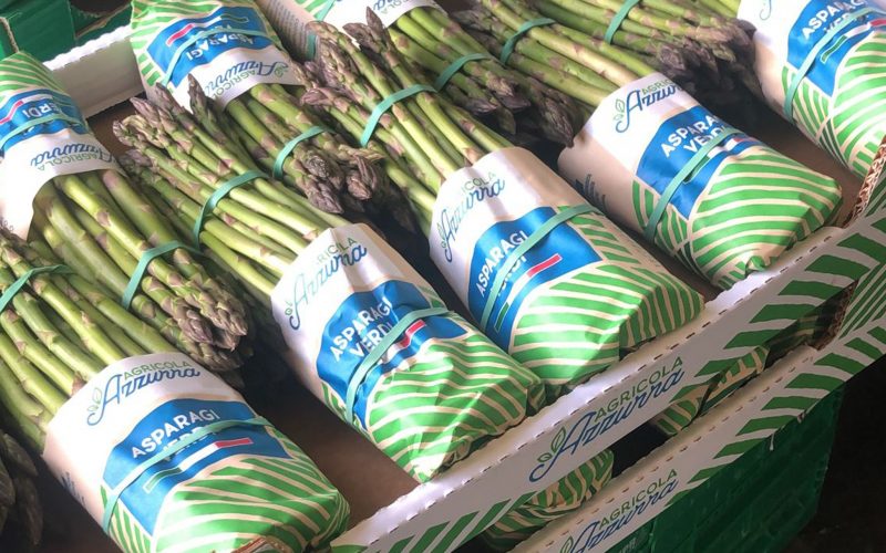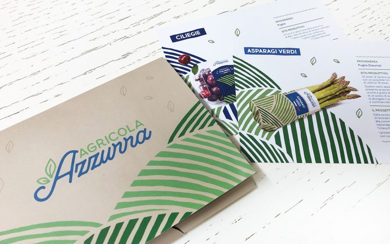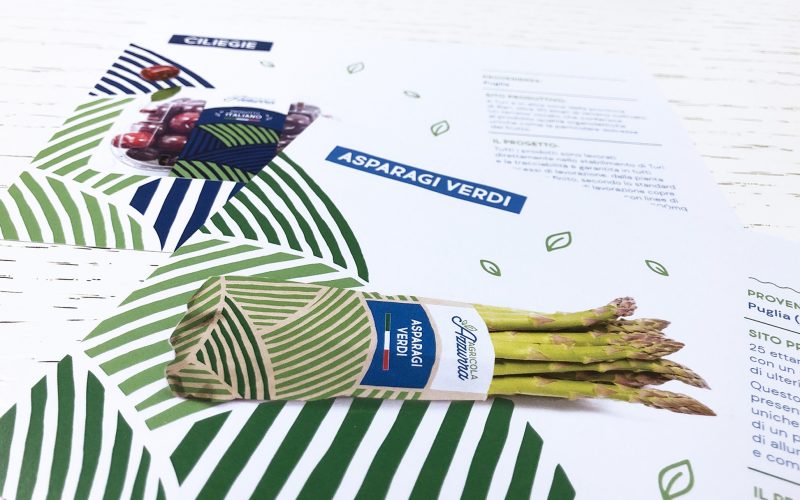
Agricola Azzurra makes its debut in the large-scale distribution with a strong visual identity, designed on the value of fruit and vegetable quality, with an all-Italian supply chain, where the Italian spirit is told without using the Tricolore.
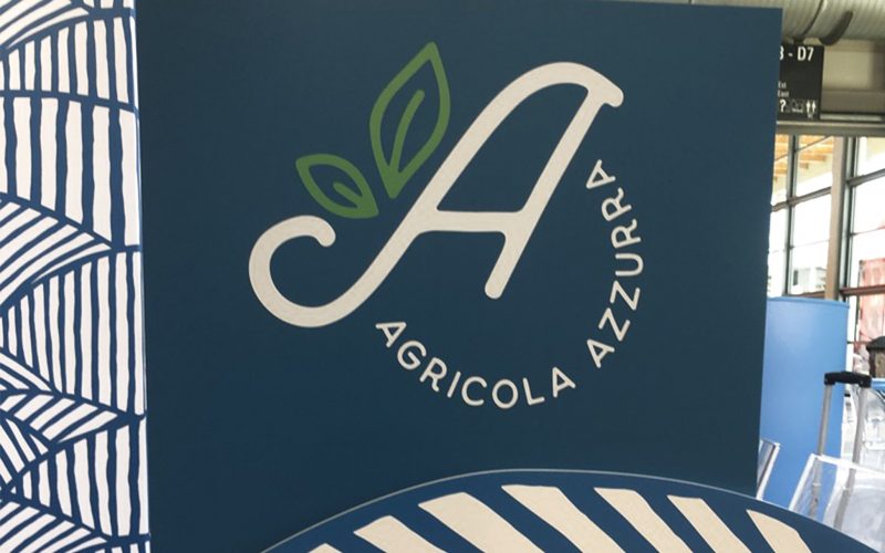
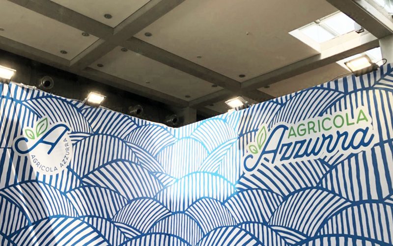
Gentle plowed hills, a clear sky and a sprout that grows out of the logo become an icon of the brand that identifies itself with the goodness of the made in Italy raw material, renowned all over the world.
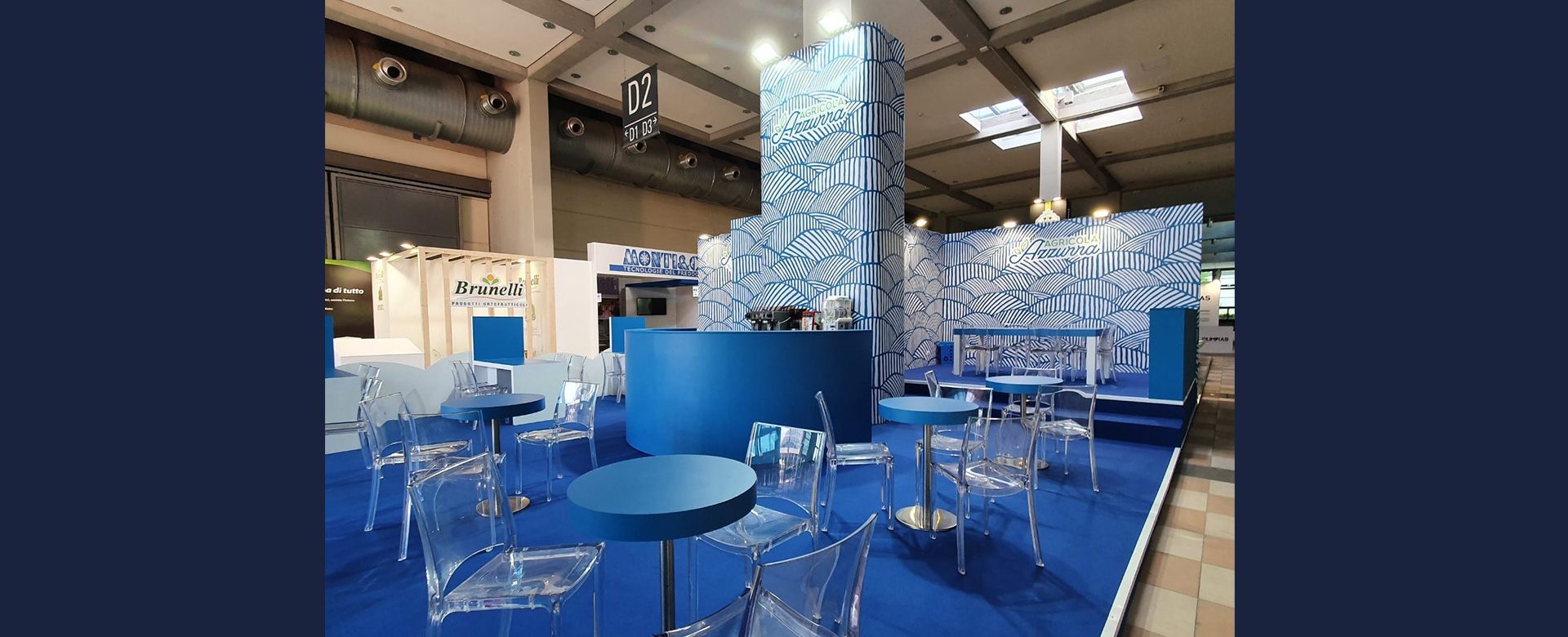
From the naming to the corporate identity, to the study of eco-sustainable packaging for all product lines up to the stand format set up for congresses and trade fairs, Agricola Azzurra gets a new look, leveraging on the concepts of: sustainability, Italian spirit, short supply chain and freshness of products.
latoC puts itself to the test with the relaunch of a brand to be valued and does so with all the passion of which Italians are capable.